Role
UI/UX & Web Designer
Timeline
1 Week
Tool(s)
Figma
Introduction
Welcome, and a short preface:
Hello, and welcome to my case study on redefining Tip it Forward’s user experience. I’d like to remind you that these are solely my suggestions that I feel constitute a change to the website and the donation/volunteer process. These suggestions are based off of pain points I can personally foresee occurring, as well as some light competitive analysis and user flow breakdowns.
I’d like to preface this entire case study with reassurance that expert opinions, user experience data, and the iterative process are all vital to a project. Unfortunately, without that information at hand I can only show you my thought processes and steps I would take at improving the experience without said information.
Breaking Down The Requirements Document
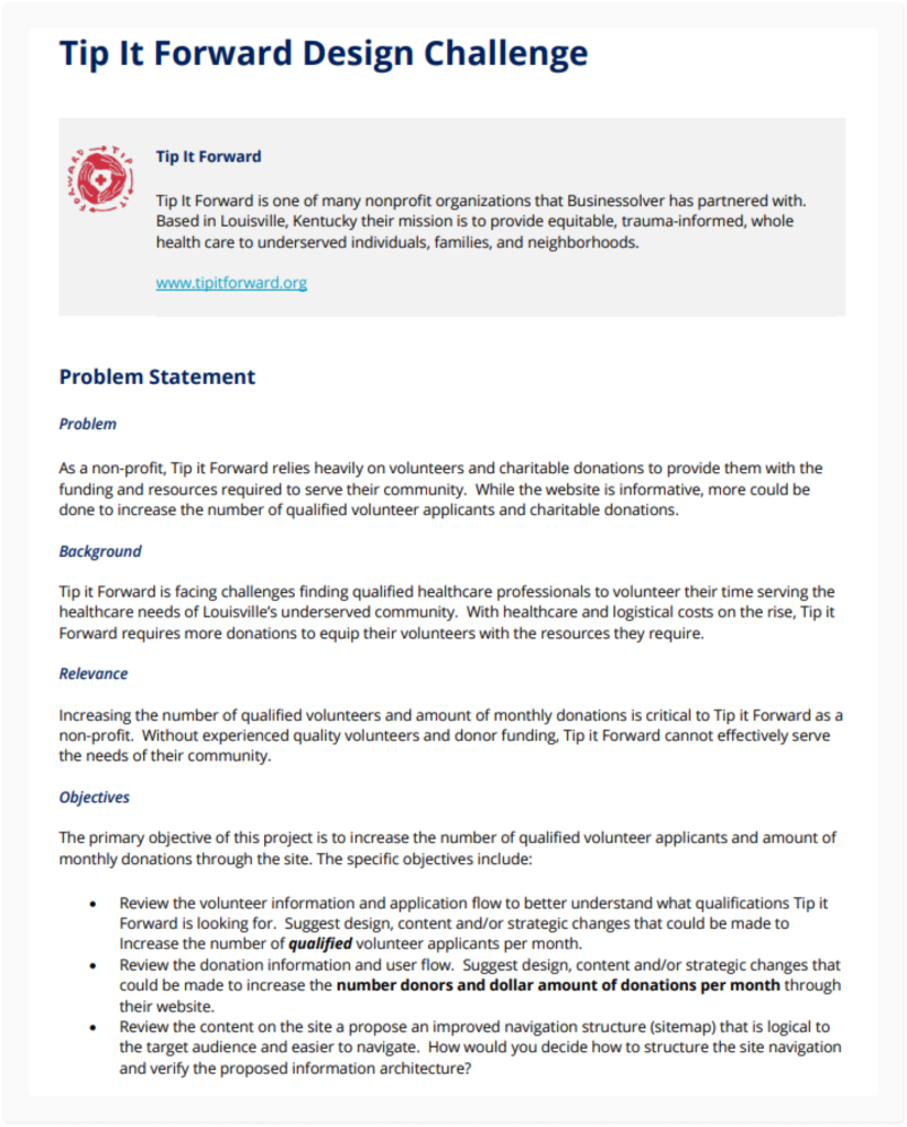
The first step that I took was to break down the information and objectives within the requirements document and determine the overarching goals that I was to achieve. From that I learned more about Tip It Forward,
their site’s user experience issues they were noticing, and the importance of resolving these funding, resource, and volunteer issues.
I then structured the three main objective bullet points within the document into single category buckets:
The Website
Navigation
Moving “Our Impact + Results” under About Us:
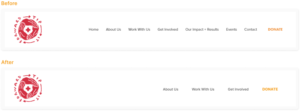
For this first suggestion, I believe that “Our Impact + Results” should be moved to a sub-page under the “About Us” nav section. As a new user, if they are trying to gather information about Tip It Forward in general, the “About Us” section should be the prominent area to direct users. Additionally, the “Our Impact + Results” page itself is light on content, and likely doesn’t need to be a standalone page anyways, in my opinion.
Moving “Events” & “Contact” under Work With Us:
This choice is a bit more obvious, but much of the same sentiment. Reducing visual clutter and having less decisions to make upfront will not only help with the overall user experience, but more specifically will assist in concentrating traffic to the areas that users intentionally want to be in. Alternatively, these can also be housed within the footer.
Naming Scheme Suggestion:
Finally, the terms “Work With Us” and “Get Involved” are fairly similar to one another, and could also impact the users navigation negatively if they confuse the two. I would suggest reworking the names of one or the other to be easier to interpret without needing to click on each page to gather more information.
The Home Page
Making a stronger empathetic connection:
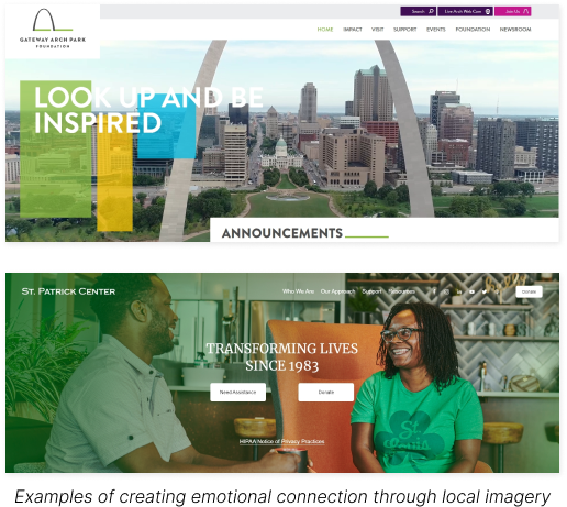
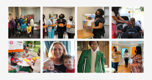
Currently, there is no visual representation of the community that Tip It Forward is building until much further down the page. I would suggest making the hero image either a picture of those that have been positively impacted from Tip It Forward, or a local monument or location that everyone in Louisville would recognize. This will not only help new users create a stronger emotional connection to the organization, but ideally drive more donations and volunteer services.
Organizing the home page:
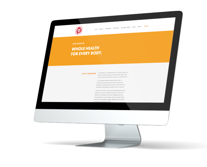
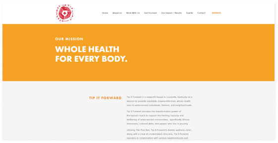
The home page is the most important page on a website, so getting it right is vital. Currently, the hero section only displays a very short mission statement. It then goes onto describe what Tip It Forward is, but in a very odd section where all of the information is just listed in paragraphs and all of it has been pushed to the right column. This not only makes more work for the user to learn about the organization, but poor design choices can make users lose trust in sites very quickly.
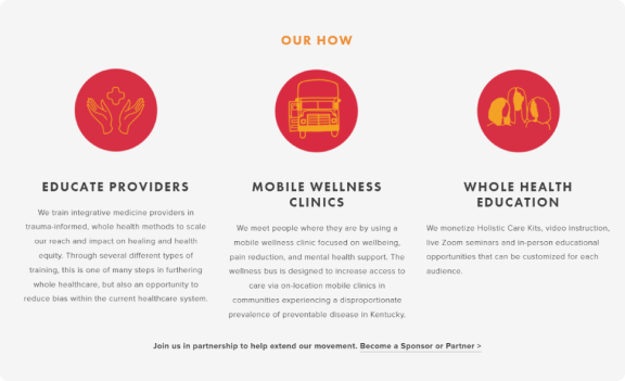
The “Our How” section is visually appealing, and does a much better job at explaining what Tip It Forward does (although I don’t think the naming scheme of “Our How” works)
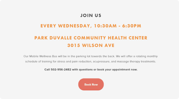
The “Join Us” section could use slight user improvements, like a map link that can give directions to the address, or a map widget, but it isn’t too bad.
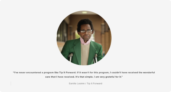
The testimonial section is great, and any testimonials that are put on the website will help build trust for new users. My only suggestion would be to continue adding more quotes and testimonials to that section, rather than just one.
Finally, the only other thing I would like to suggest would be to link the images that are below the testimonial section with an instagram widget or something similar, just to continue driving traffic to social medias and assisting in SEO.
Donations
Donation Flow & Directing Issues
Reducing Redirection:
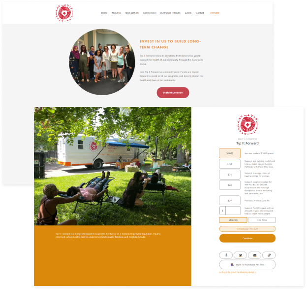
Firstly, I’d recommend simply adding the donation process onto the actual donation page, rather than the intermediary page with information, and then the donation page with just the donation options. This can reduce user dropoff and assist in keeping the user in the same environment.
Design & Content:
There are some slight design inconsistencies across the donation experience. Things like odd button placement, different button colors and padding, poor visual hierarchy across both pages, and odd default selections on the actual page itself.
My suggestions would be to ensure a consistent branding experience across all pages (this helps build trust) via a solidified design system. I also would recommend reorganizing/rethinking the content and how it’s being displayed on the donation screen. There seems to be a single font, which is ideal, but a large variety of weights and italics used intermittently that unfortunately throws off readability for the sake of design, which isn’t ideal.
Additionally, the fact that the “$1,000” selection is at the top and default, and the fact that the “Monthly” selection is also default, strikes me as odd and to be honest, a bit predatory. Realistically having these both set to default suggests that the user would be donating $1,000 a month to Tip It Forward, which should not be a realistic expectation.
I would suggest moving the custom donation field to the top, and having a grey prefilled text at $10. Secondly, I would make the default donation type to be one-time rather than monthly.
The user must trust that their money is going to a good cause, and small things like the suggestions above can really make a difference to some people.
CTA Placement:
The implementation of a donation button somewhere on the home page is absolutely needed. It’s definitely in a good place in the nav, but I truly think that donating should be the main CTA button on the page. The fact that there is no button above the fold at all is a huge negative potential for user dropoff.
Volunteers
Volunteer Flow, Additions and Replacements
Dedicated Home Page Section:
I’d recommend adding a section dedicated solely to the impact and difference volunteers can make on the home page, and a button leading directly to the “Join Our Team” page. This will help new users who may be qualified find out how to help quicker and easier.
CTA & Section Reorganizing:
The hierarchy of the page itself is a little odd at the moment. I would suggest moving the we are hiring section in a box below the supporting imagery, utilizing the large amount of white space that currently throws the balance of the page off. This information is important, but in my opinion does not need to be the main thing this page suggests its users to digest.
I would then suggest moving the “We love our volunteers” section to the above section, as the main CTA of the page, which will also resolve the issue of the button being buried below paragraphs of information and close to the fold.
Afterwards, the “Process” section can be inserted, which they can read further into the process to either determine next steps after clicking the CTA, or learn more to decide whether they wish to click the CTA or not.
Additions and Transparency:
Currently, there is no way to determine whether a potential volunteer will be qualified or not from the user perspective aside from the “we are hiring” section.
I highly recommend adding a section that either A. lays out exactly the skills or types of volunteers the organization is looking for, such as a “What you need” section or something similar, or B. shows the user a handful of previous or current volunteers and their skills. This would also be a great way to pay respect to the current volunteers, as if this was a “spotlight” section dedicated to some of the volunteers that have made the biggest impact in the last X amount of time.
Finally, I recommend setting up more avenues for questions and concerns at the end of the process section, such as email, chatbots, or texting directly. Additionally, I believe and making quick links to these communication avenues directly on the page will provide the least amount of dropoff as possible.
Qualifications and The Form:
Now that the page has been reworked for new users to get easier access into the application process, the next step will be to work towards the original goal of increasing qualified volunteers specifically.
The first step will be to move the application form off of google forms. While Google forms can be used professionally and I’ve researched other non-profits who use it, I would recommend creating either a dedicated page or inserting the form directly into the Join Our Team page to help build trust and increase transparency on the user side. There is potential to lose valuable volunteers solely because they are being taken out of the Tip it Forward experience and into a separate Google Form.
Next, tackling the qualifications issue. Currently, the only volunteer-specific question on the form is “Have you ever done any community organizing, community engagement, event planning, or outreach?” which even then isn’t entirely volunteer specific. I believe that some of questions on the form should instead be asked during the interview process, and those questions replaced with volunteer specific questions to better vet the potential people wanting to help.
Based on other volunteer forms I’ve researched from other nonprofits in my own area, I believe the following questions would be beneficial to add onto the form:
- What do you hope to gain from your volunteer experience?
- Why do you want to volunteer at Tip it Forward?
- Please list previous volunteer experience (List each organization and length of service)
- Can you provide references from previous volunteer or work experiences.
With these questions added, the motivations, previous experience, and any references can be taken into consideration before the interview process begins, which could be a great help in vetting the volunteers who are more qualified and make a bigger impact at Tip it Forward.

Conclusion and Final Mockups
Overall, I genuinely enjoyed this opportunity to show my thought process and hopefully help advocate for the donator’s experience, with the end goal to help make a positive impact!
Through my drive to not only achieve business goals but also push for user intuitiveness and clarity to be at the forefront of my decision making, I feel confident these changes would be greatly appreciated on both sides of the aisle.
Thank you
Home Page Redesign Mockups & Wireframes

