About This Project
This case study explores my strategic design process at Healthyr that led to significant business outcomes. My journey at Healthyr was not just about designing interfaces; it was about embracing the company’s mission to disrupt healthcare access and making health tests more approachable and user-friendly.
Tools Used:
My Role
Senior UI/UX Designer
Team Members
Ilana Appleton (Director of UX)
Tyler Phillips (Senior UI/UX Designer)
John Hysong (UX/Web Designer)
Timeline
1 Year
Key Metrics
Here’s a few of the statistics that I feel are quite noteworthy as a part of my contribution to Healthyr.
Increased user retention by 23% in the first quarter after being hired.
Increased blood kit consumer ratings from 3.7 to 4.3.
Conducted email campaign that increased sales by 900% in it’s first week.
Designed and implemented 40+ webpages via Figma/Elementor
Designed and tracked user success for 3 separate user portals.
Initiated and managed 2 expansive research projects.
Researched and established 5 user personas.
Assisted in decreasing customer service calls by 14%.
Initial Objectives & Research
Shortly after I was onboarded, I was tasked with two critical objectives: firstly, to identify and resolve existing negative user experiences and issues within the app through an extensive user research initiative that involved engaging with end users and collaborating with various teams across the business; secondly, to significantly enhance the design aesthetics of the portal. These tasks allowed me to get better familiar with the product and it's user base.
Here are some peeks into the findings of the first objective.
Empathy Map

About
Isabella, a self-employed designer, is keen on maintaining her health proactively. With no employer-provided benefits, she’s taken the initiative to purchase Healthyr’s at-home test kits. Intrigued by the insights and tracking features, she’s exploring the portal further, especially considering the potential benefits of the subscription service.
AGE: 34
OCCUPATION: Graphic Designer
INCOME: 85k
STATUS: LTR
LOCATION: San Diego, CA
Needs
- Easy-to-understand insights and recommendations based on her test results.
- Transparent cost structures for the subscription service and any added solutions.
- Assurance of data privacy and the credibility of partnered solutions.
- Convenient options to integrate additional services, like telehealth or wellness solutions, without hassle.
Pain Points
- Finding a reliable and comprehensive platform that offers a wide range of health services.
- Concerns about the costs associated with additional health
- services.
Navigating and understanding the myriad of health insights and biomarkers. - Making informed decisions on which solutions or partners to integrate into her health journey.
Insights
After analyzing and discussing the results from our research, we were able to determine various insights into what negative user experiences were occurring. We took immediate action and began establishing strategies and features to combat the following issues:
Establishing Questions
We asked ourselves 3 questions that as we began designing the new experience, centering them around improving the determined issues:
Question 1
How can we cement the importance of preventative healthcare and inform the user of the process without overwhelming them?
Question 2
How can we build trust and drive traffic back to the portal after taking the test?
Question 3
How can we make the portal an intuitive experience that is easy to navigate and learn regardless of age?
The Solutions
I wanted to provide our users with agency. Informing them of the importance of certain tasks without pushing them.
We gave the user the required information and next steps they could take after receiving their results, but did not push them too far in one direction or another.
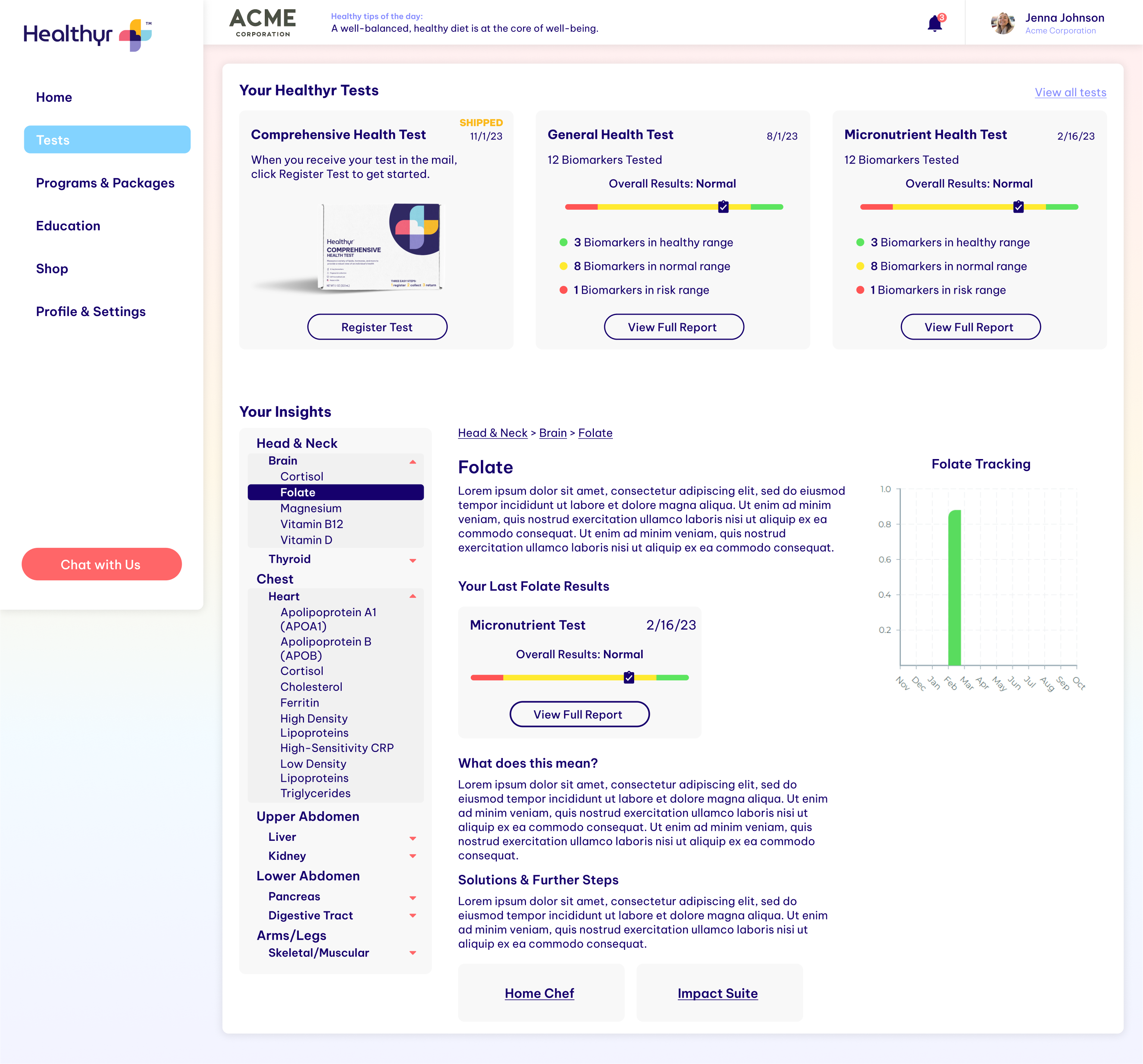
I decided to create a section in the portal that was dedicated to preventative healthcare information and strategies. This allowed for us to point to that section at any chance we could for the user to learn more, while also not overbearing the user with a ton of information that they may not need or want.
Then we set out to build a user flow to tackle the navigation and intuitive experience of the app. With the information section in mind, we focused on providing the user with action items first and foremost, and referring them back to the information section when needed, to supplement the deeper processes of building up the users health/biomarkers.
While navigation and agency were important, we knew that the portal at the time lacked any value that the user could justify. It was not uncommon to see users purchase the $80 tests and not even care enough to check their results, or do anything about it.
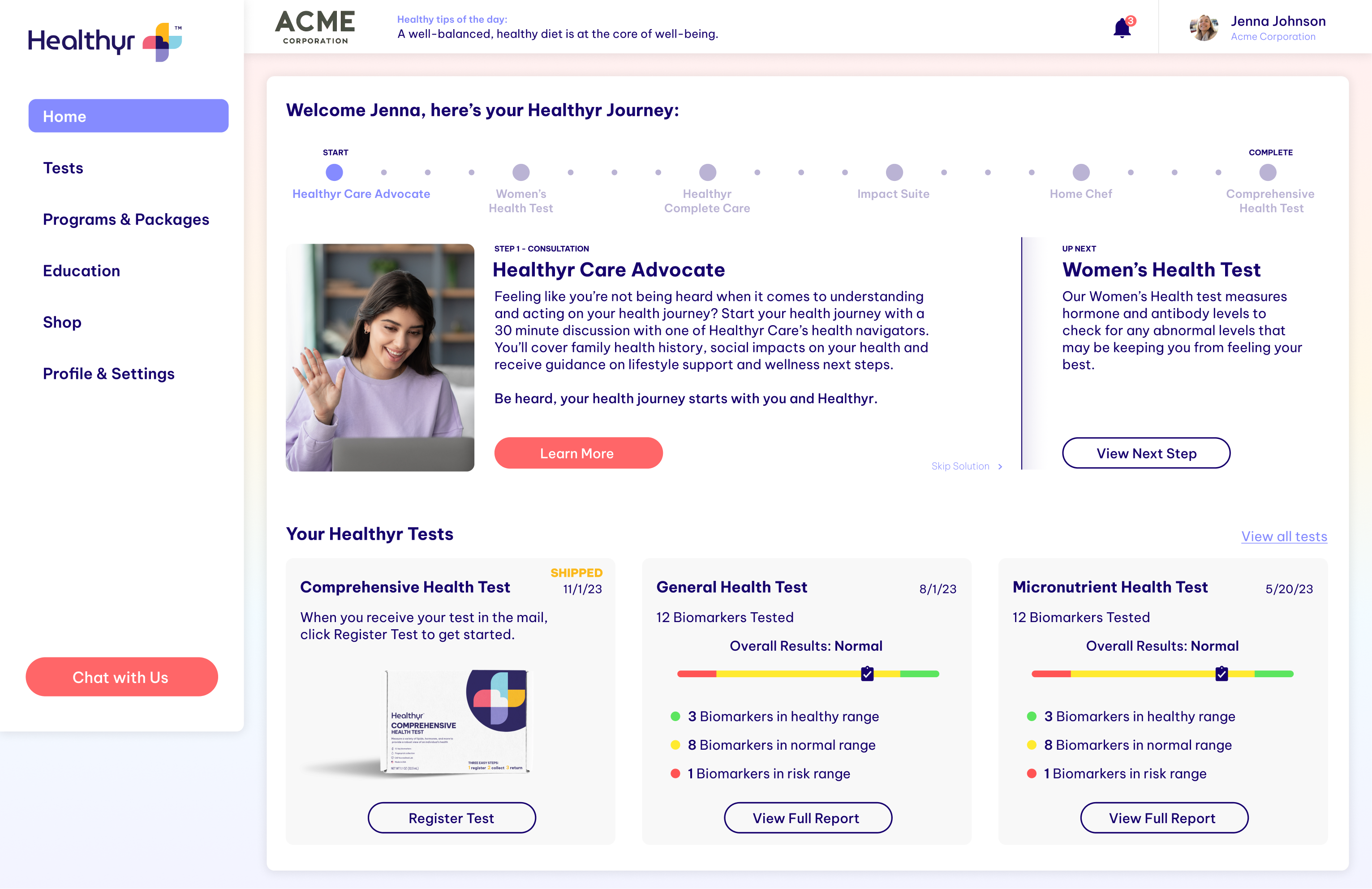
This was solved through a multitude of features that I added to give users reasons to come back and continuously purchase tests to track their improvements over time.
A few of these features were things like:
Biomarker Results and Tracking Graphs
This allowed the user to track their health changes over time, which also warranted additional purchases of test kits.
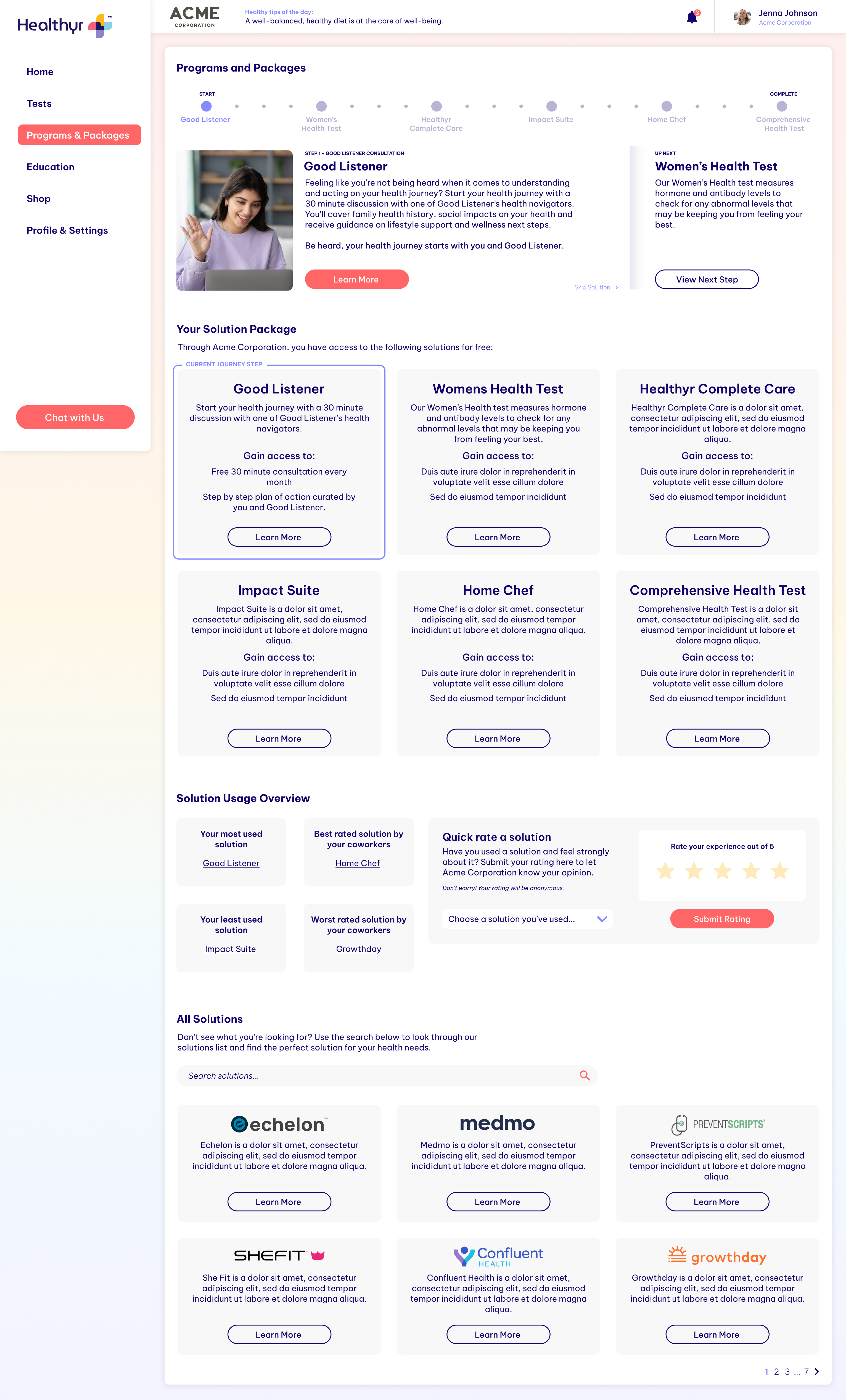
A True User Journey
This was established to guide users through the process of preventative health steps that they could take, which also allowed us to nudge them towards our many partner companies. We were able to create an ecosystem among us and our partners, from telehealth opportunities, gym memberships, blood pressure stations, etc.
Shipping and Status Updates
This feature solved for the issue some user interviews had brought up, which was that once they mailed their blood kit back out to the Healthyr labs, they were in the dark for weeks, as the labs took a while to analyze the blood.
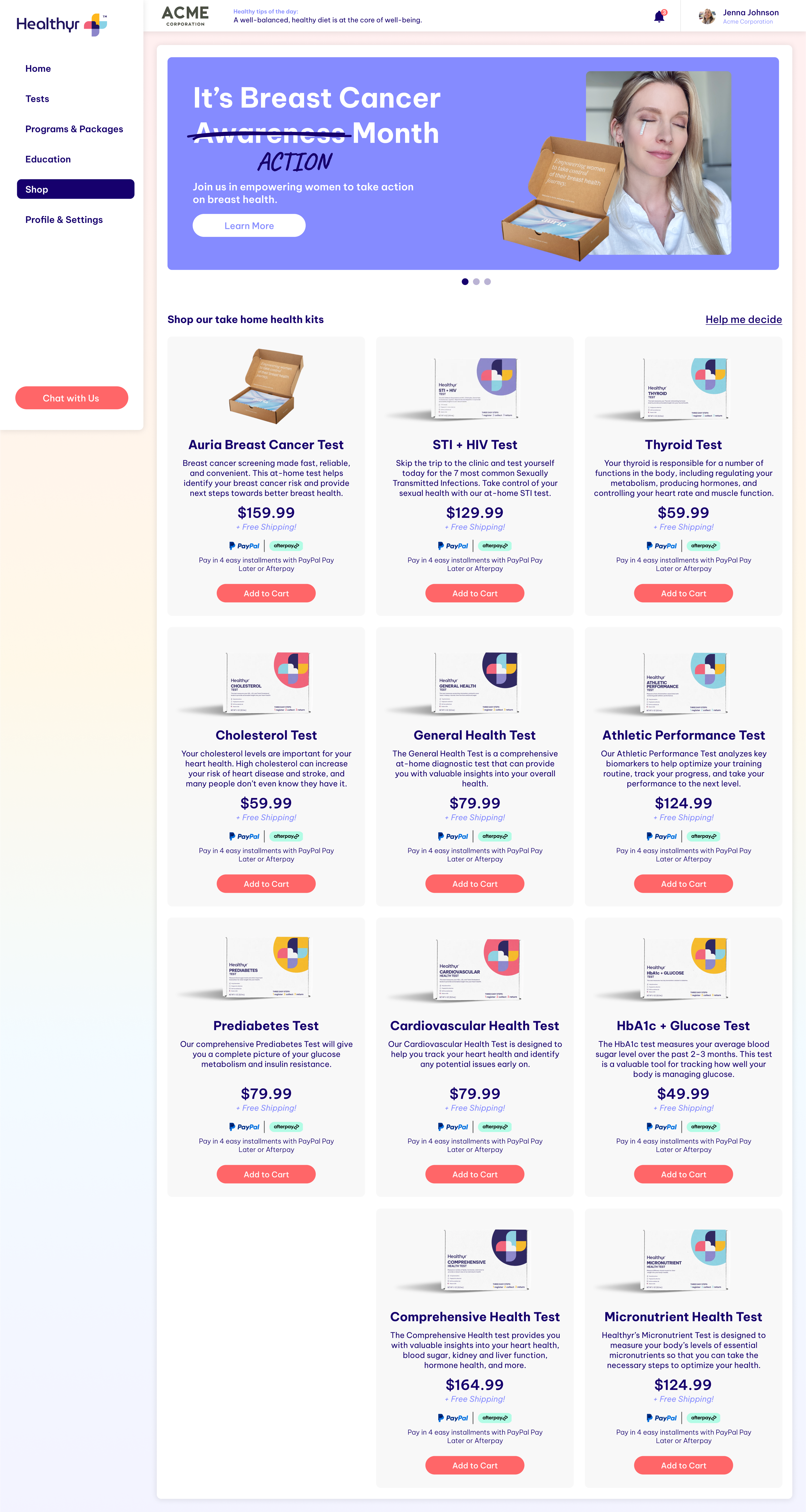
Final Screens
Ultimately, the design process was an intense collaborative effort between myself, Ilana, and the marketing department. From low to high fidelity, prototypes, user tests, and stakeholder presentations before an eventual handoff process began with the devs.
Oh...and one more thing
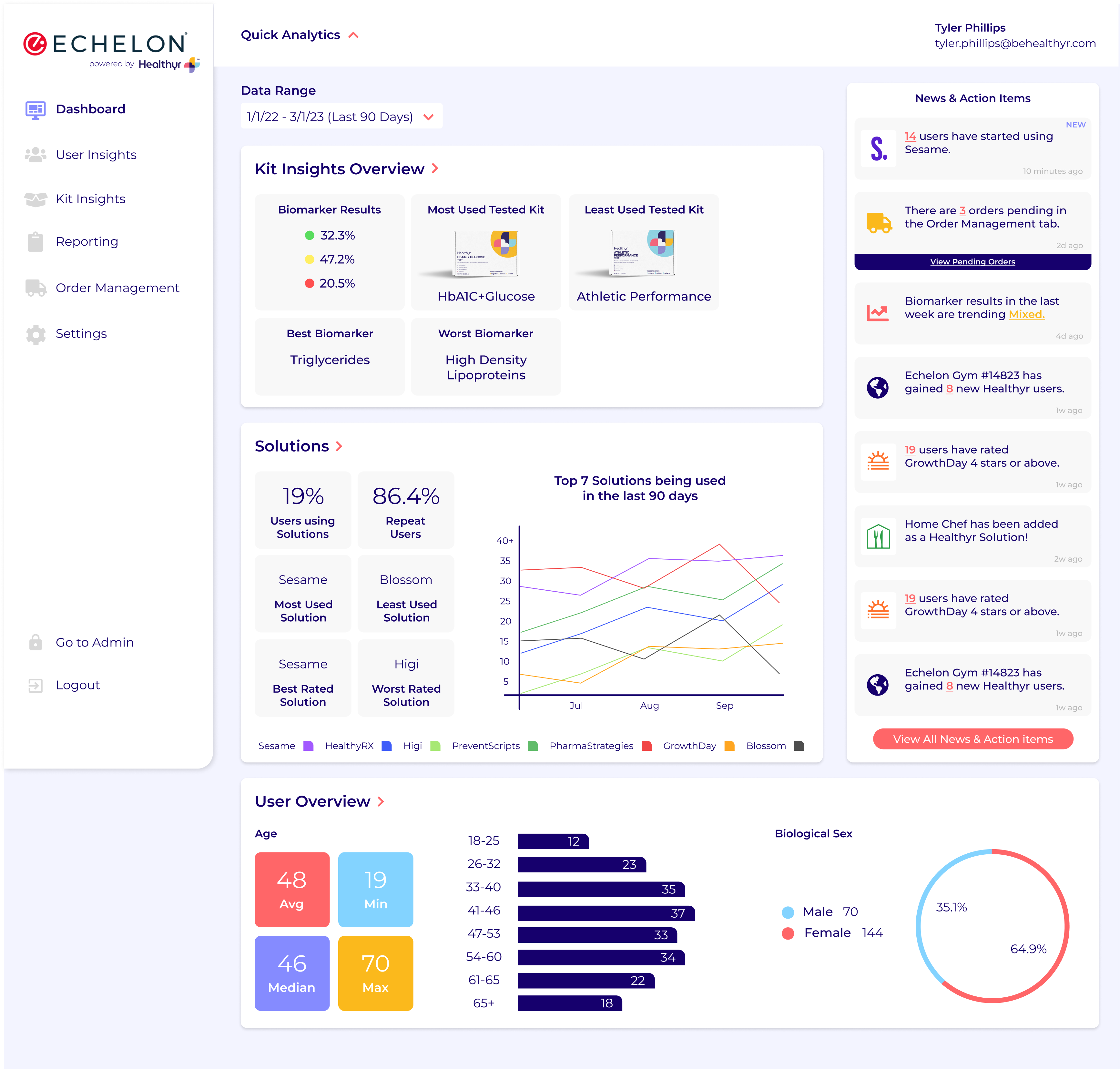
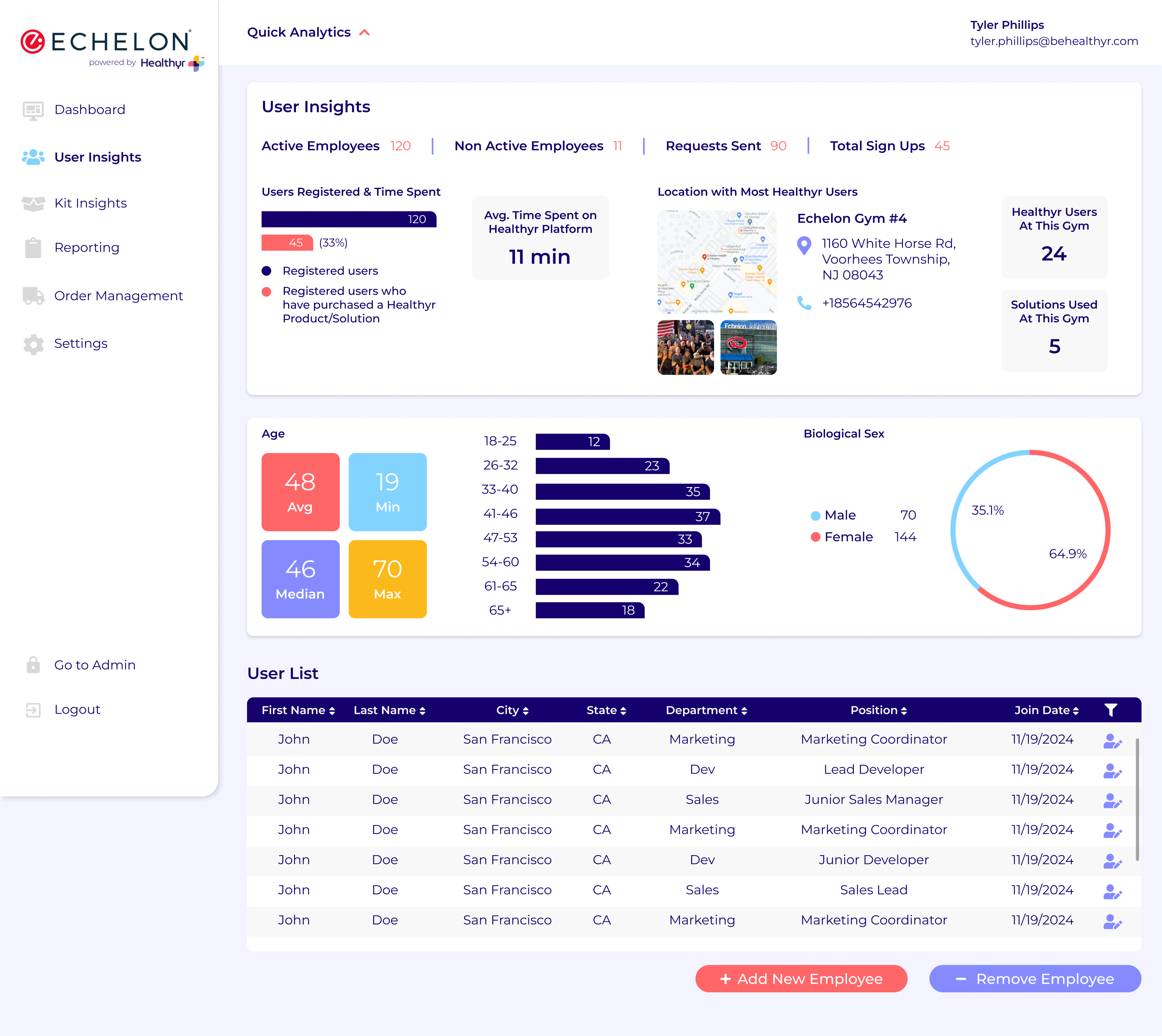
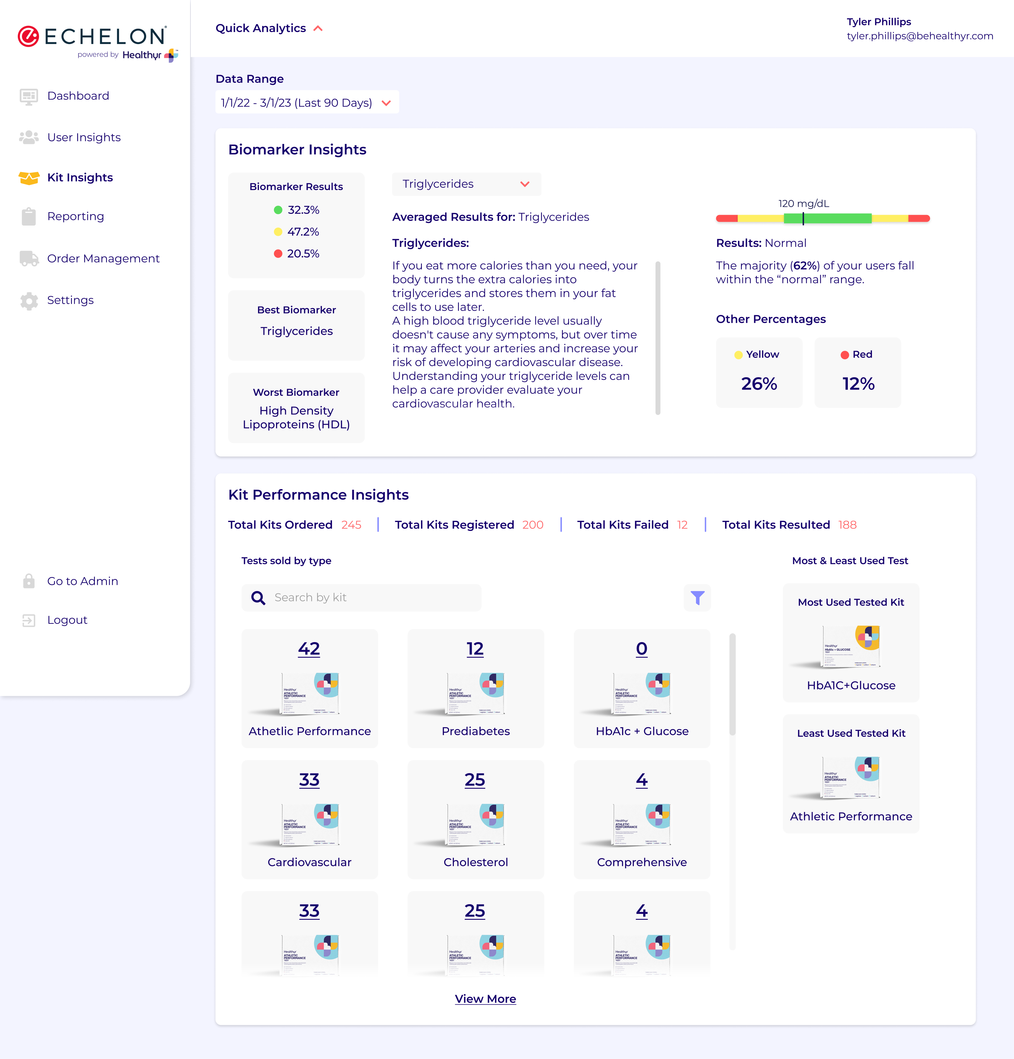
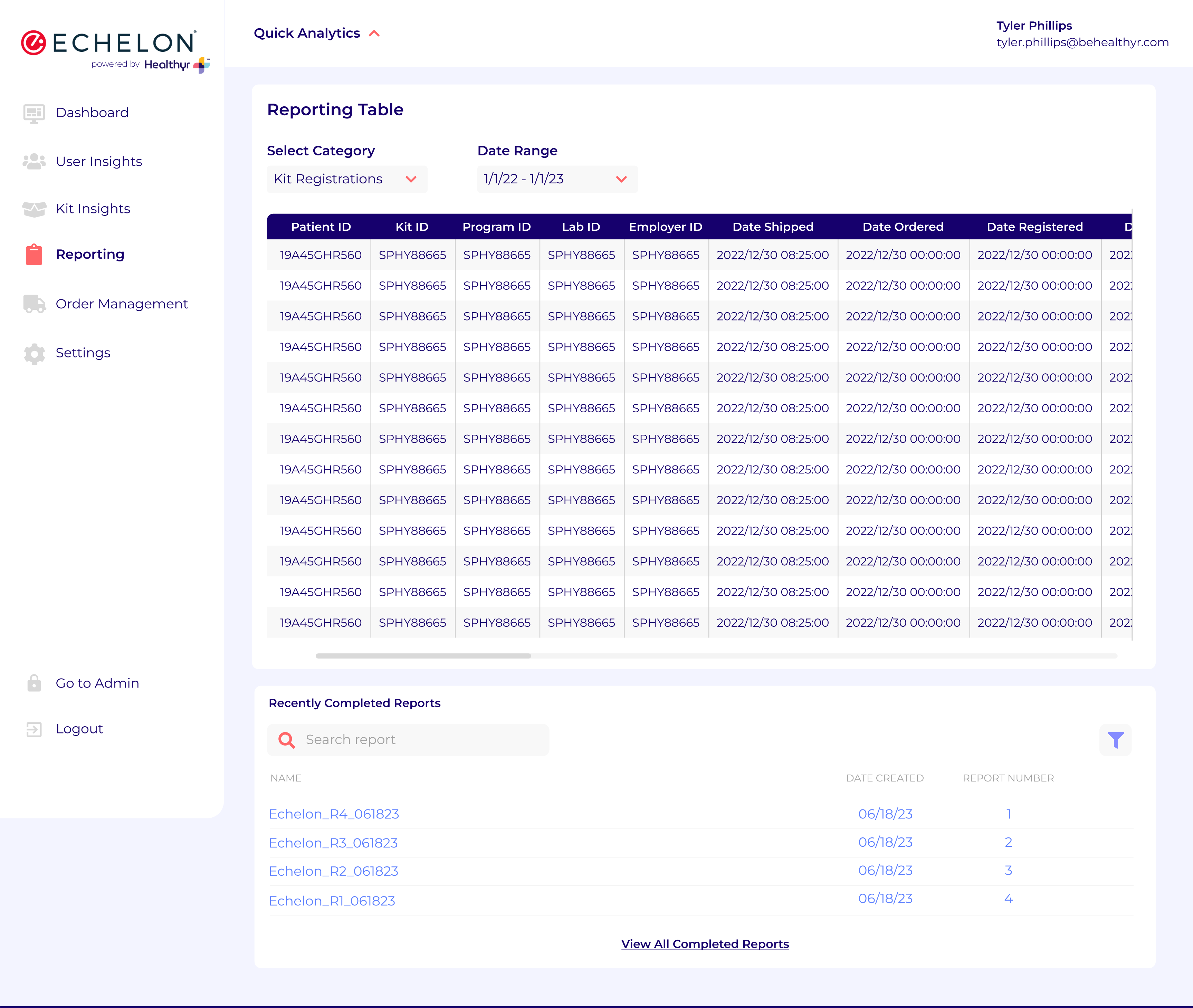
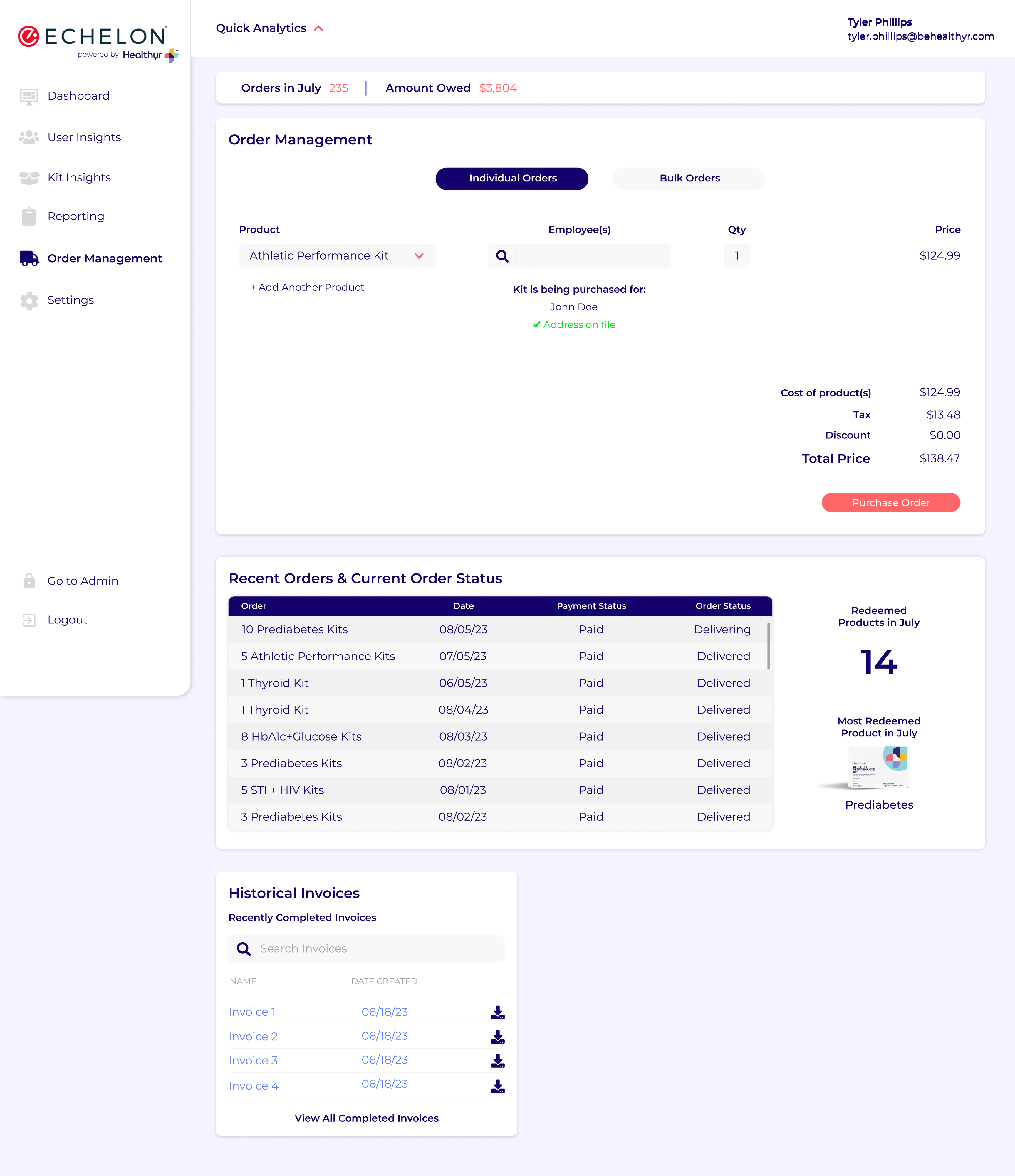
That was JUST the core user portal, I also designed the Business Analytics Portal, & the Customer Support Portal. Each project had dedicated research and testing time, but business goals and use cases were entirely different. It would warrant an entirely separate case study, but for now here are the high fidelity mockups for viewing.
What I Learned at Healthyr
I learned about the preventative healthcare industry and the fact that a vast majority of people are adverse to the thought of caring for their bodies before they are given a reason to.
I learned about the love that I have for designing within the healthcare space, and the genuine difference making decisions we were able to make that could actually help save lives.
I learned the importance of teamwork and gained leadership skills through managing a junior designer. I also developed my presentation skills through stakeholder meetings and decision justifications.
Additional Hard Skills
Gained and refined skills in Figma, WordPress, WooCommerce, Elementor, Canva, Google Analytics, HotJar, Adobe Creative Suite, & More.
