Role
UI/UX & Web Designer
Timeline
1 Week
Tool(s)
Figma
Introduction
As a design task, I set out to create a feature within the TORSH Talent App that would feel seamless. Even with my limited knowledge of the app itself, I was still driven to build an experience that was easy and felt familiar to the user.
Problem
The goal of this task was the create a feature that would ease the experience of the user when they were attempting to assign an overarching goal to one or multiple other users with steps. The way it was currently implemented caused the user frustration due to the “one by one” nature of the assignment process. Needing to navigate user by user took much longer than preferred, especially in the industry that is eduTech.
Solution
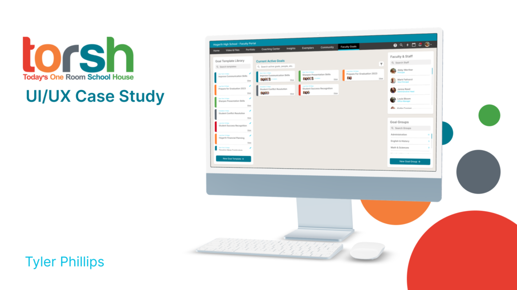
The solution to these problems had been determined already via the task handout. There were multiple aspects of the feature that needed to be designed, such as the grouping of users, creating template goals and a library to hold said templates, and management features such as monitoring tasks or progressing tasks further manually. It was my job to interpret the task handout and its needed features and build the experience.
Inspiration Analysis
Rather than a competitive analysis, I felt it was a better use of my time (as I don’t know TORSH or the industry enough) to instead find inspiration and features in other web apps that I could bring over to what I was designing. The more that I read into the task and what was needed, I began imagining something similar to Trello or Jira. The ease of assigning members to tasks, and dragging cards to designated areas assisted not only this task but stayed within the realm of component based design which is something I know TORSH wants to use as much as possible.
Personas
Abby is the persona that I was given. She’s a Principal at Hogarth High School, and she’s trying to generate reports for the teachers that work there. She’s hoping the can improve the teachers weaknesses through the TORSH Talent App via goals and progession-based steps, but it currently takes too much time assigning each person a goal.

ABOUT
Jenna is a nursing student who recently has not only found an apartment for herself, but wants to spend less money on take-out and begin cooking for herself more often.
AGE: 23
OCCUPATION: Nursing Student
INCOME: 45k
STATUS: Single
LOCATION: Denver, Colorado
NEEDS
- Quick & easy recipes she can save money on if she cooks them herself.
- A list of ingredients for each recipe, along with tools to help her (a beginner) in the kitchen.
- A sense of community in the app, to help build trust for each recipe. Reviews, comments, etc.
FRUSTRATIONS
- A lot of recipe apps are just recipes, and there isn’t much of a community aspect.
- Various tools are scattered about the internet, it’d be nice to have cooking references all in one place.
- Going to different sites for recipes has me losing track of some of them. I need a way to organize my favorite recipes.
Sketches & Low Fidelity Testing
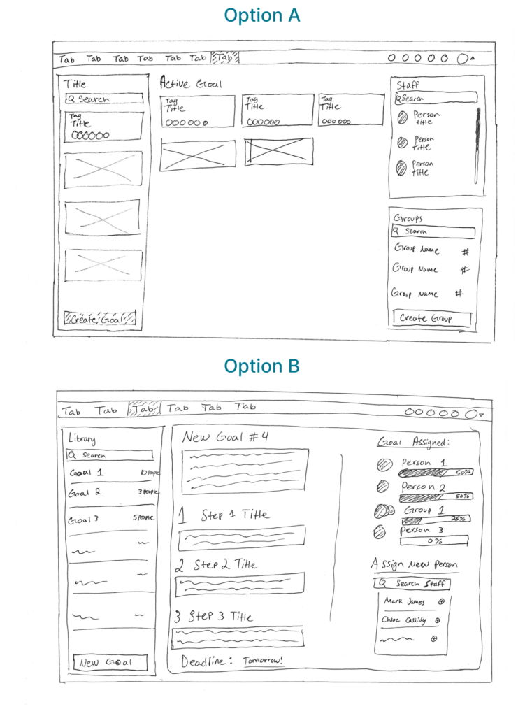
I had two options in mind when sketching the new goal feature. Firstly was a card based system with users, groups, and templates all on the screen at once, in different components. Further screens would be modals, but the idea would be the user wouldn’t have to leave this screen. “Assignment” would take place through drag and drop, whether it was assigning users to goals, or assigning users to groups that then were assigned to goals.
The other option that I thought had some merit was a tag based system. The user would simply go to a user or an established group’s profile and a tag dropdown would be available to assign goals from the template library on a separate screen.

Interviews
Although limited on time, I did quickly interview a couple of individuals based on the low fidelity wireframes. I wanted to get their opinions on the two options that I had sketched out, to assist in making an informed decision on which to further design out.
Questions:
- Which process confuses you more, option A or option B?
- Does option A have too many variables on the screen?
- Do you mind option B needing to navigate to multiple screens?
- If you were Abby, which option would be quicker to learn?
- Do you think either of these options will speed up Abby’s process?
- Are there any features you’d can think of that I haven’t accounted for?
Conclusion:
After reviewing and comparing the answers from both interviews, there were 3 key things I could infer about both options.
Both interviewers and myself preferred option A.
More organization based features should be implemented on the active card screen, as to help break up monotony and get lost trying to find goals that all look the same.
Although a tag based system would work fine, the benefit of not having to navigate to multiple screens outweighs all else.
Wireframes
Wireframes was the easiest step in this process. I was pretty confident in the card based option, and simply crafted the low to mid fidelity wireframes with a standardized margin in comparison to the example page I had found via the TORSH website.
Hi-Fidelity Mockups
With the High Fidelity Mockup phase, I focused on the design that had already been established within the TORSH Talent App mocks on the website. I was informed that the way the web app looks and is built is very particular, so I tried to echo the same in my designs.
Final Words
I had a lot of fun with this task, and it was a great opportunity to design something for the edtech space. I hope I can continue to design things that will make an impact, especially if it can help teachers do their (already very difficult) jobs!
Tyler Phillips
